
Interview with Shrishti Vajpai – What Is It Like to Develop a Visual Identity for Fight for Kindness?
- TypeCampus

- 2 mar
- Tempo di lettura: 8 min
Aggiornamento: 3 mar

Shrishti Vajpai is the Creative Director of TypeCampus and the creative mind behind the visual identity of all four editions of Fight for Kindness initiative.
Shrishti is a graphic designer and creative director from New Delhi, India, with a primary focus on branding, visual strategy, and graphic communication. With 15 years of experience in the field of graphic design, she has worked across hospitality, fashion, lifestyle, events, F&B, and real estate industries. She is deeply passionate about typography, and this sensibility is evident across her work. For the past five years, she has been collaborating with TypeCampus on the Fight for Kindness campaign.

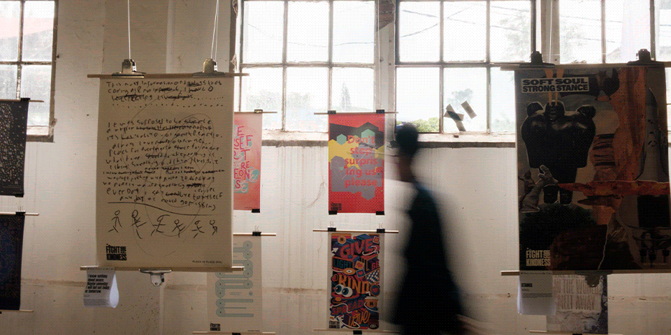
Visual identities of Fight for Kindness project through the years
As we are preparing for the launch of the new Fight for Kindness open call, we decided to pull back the curtain and reveal some of the behind-the-scenes magic by asking Shrishti to share her experience working on the visual identity of FFK (Fight for Kindness).
FFK started in 2022 and grew enormously during those years, now approaching its 5th edition. Can you tell us how it all started? How did the project evolve and change through the years in your opinion? What feels different about it now?
The first edition in 2022 was a modest start. TypeCampus was still new, and fewer schools and designers knew about it, so Debora Manetti (Co-founder of Zetafonts and Director of TypeCampus) and I spent a lot of time reaching out via emails and Instagram to share the Fight for Kindness project. Many messages went unanswered, but enough people responded to motivate us to continue.
With the support of Zetafonts (our campaign sponsor) and our early partners, the project slowly began to gain traction. What started as a dream to be part of leading industry events like Forward Festival, Graphic Days Torino, Designa, Bangkok Design Week, Bandung Design Biennale, and Brno Bold, and to be exhibited in beautiful galleries such as House of Lucie, became a reality by 2025.
2025 year of Fight for Kindness
Over the years, participants began taking the initiative to host exhibitions themselves, such as Radimira Yordanova, Leah Perrino, Katie Jones, Nako Baev, and Irpan Alfian, which led to the formation of the Ambassador program. We also welcomed media support from Gerry Thee, now an official Ambassador, and Abdelrahman Barakat, who helped take the project to Egypt and Malaysia. With their help the project expanded across multiple cities and countries. At the same time with Debora’s dedication, the number of official guests grew, from around 4 industry professionals in the early editions to 11 in 2025!
The fourth Annual, Visual Voices for Change, also featured a foreword by Steven Heller, a profound and leading voice in design. It’s exciting to see how the project continues to grow, and I’m looking forward to what the 2026 edition brings.
Developing a visual identity for a project as complex as FFK is a significant design challenge, especially considering that it aims to position itself not as a superficial positivity campaign, but as a socially engaged initiative that encourages designers to reflect on and communicate complex social issues through their work.
Could you tell us more about your experience in creating FFK’s visual identity? What aspects did you find most challenging in the process?
The initial identity and visual language were fairly simple. The logo used a variable typeface, Heading Now, set in condensed weights, which helped the text stand out and create instant impact. This is something commonly seen in posters and graphics around social change, as these kinds of typefaces carry a sense of urgency and an attention-grabbing quality, also seen throughout the history of design. This formed the basis for the first two editions.


Work in progress behind the visual identity for the first edition of FFK in 2021-2022
By the third edition, the visual language was starting to feel repetitive. The logo had already been established with strong recall, so it was time to experiment and add a new layer, as the project had grown. For 2024, we used animated rectangles that represented the posters. They slowly animated outwards, like “opening up,” as the open call launched. These shapes were then animated in different ways to showcase the various stages — for example, for the deadline posts, the rectangles would fall down. The main typeface was Arsenica, which helped bring a stylised and elegant mood, while still remaining visually impactful.


In 2025, as we needed much more distinction between the different stages of the project, something more was needed. Everything is becoming more dynamic, and the design field is moving increasingly towards motion, so adding more movement to the visual language felt important in order to make it more engaging. Zetafonts had also released many new fonts over the past two years, and it was hard to decide which ones to shortlist — I wanted to use them all! So I thought about building a system that could include as many as possible while still serving a purpose.
Since Fight for Kindness is also about highlighting the power of typography, the visual language had to feel more typographic. I used some of the most interesting display fonts as textures and backgrounds, divided across stages, paired with simple animations and a Gradient Generator tool that Juan Garcia generously let us use for the project. The text animations ranged from playing with variable axes, to shifting kerning for “deadline is getting closer,” to letters disintegrating. For the final deadline, to reflect urgency and make it more distinctive, I used handwritten fonts like Calligraphunk, Freehand Brush, and Doc porn. For the poster gallery, I used Hagrid Black, where letters turn on their axis to reveal layers of colour, reflecting the variety of submissions. For the global exhibitions, I used Unigeo and Gronau Inline, as a nod to neon signages, with subtle colour flickering.
Where do you draw your inspiration for the project from? Were there any previous initiatives or similar projects that influenced your approach or served as a reference point?
There is inspiration everywhere, thanks to the web, so many design blogs, and creatives posting their work on social media. For Fight for Kindness, I particularly try to observe what is being done by other awards and festivals, like ADC, TDC, The one Club, Print awards, D&AD etc. They are always so interesting and original.


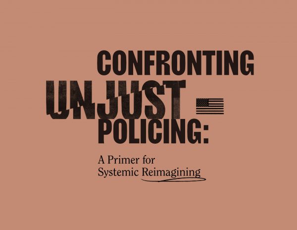

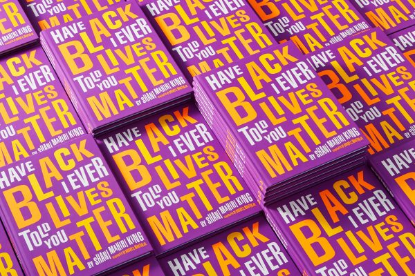


Inspiration behind FFK visual identity: 1. Peace Love Mural, 2. Confronting Unjust Policing, 3. Have I ever told you Black Lives Matter, 4. Have I ever told you Black Lives Matter, 5. LGBTQ rights are human rights
There is always a constant source of visual input. Sometimes this can be a good thing, when you are stuck and need to open up the mind. But sometimes it can also be overwhelming and can prevent you from thinking originally. The point is: what other things can trigger the imagination? At times it can be a tool, a tutorial or a typeface that sparks a sudden idea.
When Debora discovered the Gradient Generator tool by Juan Garcia, it was while we were working on the 2024 Annual book. Although we did not end up using it for that, in the following weeks, once we finished the book, an idea had already taken a blurry shape in my head for next year’s graphics. When this happens, it feels serendipitous. But it’s not always the case that something works out in the first two or three tries.

For the cover of Now More Than Ever (the 2024 Annual), we were racing against time, and I had just a few days to crack the cover. I got lucky that by the second or third try, we landed on something that worked. But for the 2025 Annual — Visual Voices for Change — I did 20+ designs, and none of them were as strong as Now More Than Ever or clearly communicated the idea of “visual voices.” Finally, after weeks of trying, looking at many different book covers, and collecting references, the idea that worked came to me at night randomly, right before I slept. The next day, I woke up and tried it out, and that became the final cover! And I have to point out that Debora’s constant encouragement and patience in this process was invaluable!

Only a small part of design drafts for the Visual Voices for Change book cover
It’s fascinating to observe how the project’s visual identity has evolved with each edition — reflecting its growth and increasing impact. Do you feel that working on its creative direction has contributed to your own development? In what ways has this experience influenced or transformed you as a designer?
Yes, definitely! A new year of the project means a new creative challenge, and I also try to push myself to be better. I love experimenting with typography, and each year, with the graphics and an open brief, I allow myself to explore more. Overall, over the past four editions, I have definitely become better at typography. I’ve learnt more subtle nuances that are often overlooked in typesetting. It’s still a journey, and I still have a lot to learn and improve, but I do feel there has been a growth in my skills.
This project has also improved my motion design skills. While my level is still basic at best, looking back at my earlier work, there has been a tremendous improvement. Every year, we release a video that encapsulates the whole project and the milestones achieved during the year. It is always a challenge to communicate this effectively in a concise manner. The first time I made the video, it was very simple and basic. Over the following years, I started doing more online tutorials and experimenting with more interesting transitions and techniques to help elevate the overall level. For the 2025 edition, we worked with Amplitudo, a brilliant sound design agency, on the main showreel music track and SFX. This was the first time Fight for Kindness had this kind of collaboration. It meant storyboarding everything first, then working through the process in constant communication so that everything was developed in sync. The result was better than ever!
With the open call for the next edition of FFK launching soon, could you tell us more about your design process when developing a new visual identity? Did it change through the years?
This year, I restrained myself and limited the design to just two typefaces! :)
When I saw the first release of Biscottini, I already started getting ideas about how I could use it for the 2026 edition. My head is my sketchbook. I need to imagine things before I can put them down on paper or screen.

Biscottini typeface by Caffè design and Zetafonts
In November, when we were neck-deep in exhibitions and getting the Annual book ready, those ideas began taking shape. The “mix” was ready, I only had to start trying it out. The idea had been slowly “baking” in my head. Finally in February I sat down to work on it, to see what would actually work. It came out slightly different from what I had imagined (as is the case with most recipes), but I think it works anyway! There’s a bit of a change in mood this time. The visuals are brighter and more vibrant, and using Biscottini adds a sense of friendliness. This is paired with Monitor, used in its wider weights, which brings in a sense of nostalgic warmth — ingredients that feel just right for mixing more kindness into our lives!
The launch of the new 2026 Fight for Kindness Open Call and the reveal of its new visual identity is just days away!
Stay tuned to not miss it :)
The 2025 Fight for Kindness annual - Visual Voices for Change
is now available
A project by Typecampus / Sponsored by Zetafonts


