

Interview with Vanessa Zúñiga Tinizaray – Fight For Kindness 2025 Guest


Vanessa Zúñiga Tinizaray is an Ecuadorian designer and researcher who merges typography, creative coding, and the ancestral knowledge of Abya Yala with contemporary design. Through the semiotic analysis of Indigenous visual signs, she creates complex modular systems that celebrate diverse world-views and ways of inhabiting the pluriverse.
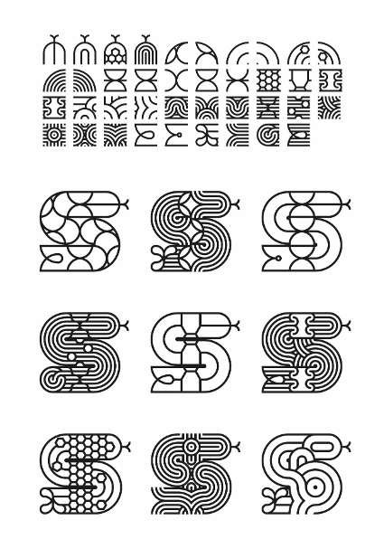
"Guardians of the Living Forest — A tribute to the women guardians of the Living Forest — a being that breathes, feels, and holds ancestral wisdom. Part of Rotsak (which means 100 in Kichwa), is an ongoing design project that honors 100 Indigenous women environmental defenders and cultural guardians across Abya Yala."

Can you share a bit about your journey into graphic design, and how typography became central to your creative practice?
My fascination with visual signs began with the project Crónicas Visuales del Abya Yala, which I started in 2004. Abya Yala, a name given by the Guna people, means "land in full maturity" or "land of vital blood," and is a way to name the continent from an Indigenous perspective. I am drawn to the signs found in archaeological pieces, textiles, ceramics, tools, and facial and body paintings from the Indigenous cultures of Abya Yala. These objects hold memories and visual logics of their own that are not always valued in formal education spaces, where external and hegemonic visual references are often prioritized. My starting point was walking through museums in Ecuador, learning to see with new eyes. Over time, I expanded this exploration to other countries, and that living archive continues to nourish my practice.
I work by observing and studying these signs, reinterpreting their structures, and transforming them into my own visual language. The process is manual from the beginning: I research, sketch, and vectorize each module. Using font software, those modules become pattern fonts, extensive families of signs that work as a system. Later, creative coding allows me to build tools that multiply combinations and generate hundreds of variations. Each typeface I design does not replicate the past but creates a visual encounter between temporalities, keeping the forms and meanings alive within a contemporary typographic ecosystem.
How do you approach the expressive potential of typography in your work? In particular how do you use the shape, rhythm, or weight of letter forms to evoke emotion and give depth to the messages you're communicating?
Form, rhythm, and weight are part of the meaning. I see each letter as a body that breathes and moves, a living being within a visual ecosystem. I work with modular systems that function as inhabited territories, where letters grow, adapt, and interact with one another. I do not seek neutrality. Typography acts as a symbolic territory that amplifies the message and creates emotional and sensory connections. In contexts of cultural defence, these letters are not ornaments; they are visual voices that live, resist, and accompany the message, weaving together worlds and times that converse without erasing their differences.
How do you hope your work contributes to a more compassionate and inclusive creative industry?
I want my work to help recenter narratives and open space for other ways of seeing and being in the world. I want it to inspire people to look to their own territories, to recognize the value of the knowledge of those who came before us, and to design from who we are.
Inclusion is not about adding diversity at the end; it is about asking from the beginning whose bodies, whose perspectives, and whose knowledge we are legitimizing. Compassion and inclusion go hand in hand with care. Design can be a place where difference is not only respected but also sustained and celebrated.
"I want my work to help recenter narratives and open space for other ways of seeing and being in the world."
In a global initiative like this, many designers choose to work in English to reach a broader audience. Others lean into their native language or script, to connect more deeply with their culture. Both approaches carry unique strengths. How do you navigate this choice? Do you feel one has more impact than the other?
I do not think in terms of one language; I think in terms of bridges. I use certain words in the language of the culture I am referring to, Spanish because it is the language I grew up with, and English when I want the message to reach a global audience. In this way, design becomes a space where languages meet without erasing each other.
There are terms that lose depth in translation. Kawsak Sacha translates as "living forest," but it means more: the forest as a conscious and sacred being, woven from relationships between the human, the non-human, and the spiritual. Including these words is not decorative; it is part of the message. Bringing them into the visual space is also an act of care and cultural resistance.

Your work beautifully blends typography, creative coding, and ancestral knowledge to create systems that honor Indigenous cultural and cultural wisdom. How do you translate such complex ideas into visual language, especially through typography? And how do you see design as a tool to amplify Indigenous voices and perspectives in a global conversation about environmental stewardship?
I work with a methodology that prioritizes observation, research, and symbolic interrelation. Through semiotic and morphological analysis of ancestral visual signs, I translate Indigenous ontological concepts into contemporary visual languages. For me, each sign holds a story, a worldview, and a way of being in relationship.
In Guardians of the Living Forest, I used the Nunka Ánent typeface family, born from the study of Shuar facial and body paintings in Ecuador and enriched by other Amazonian cultures and their ways of perceiving and inhabiting the territory. It is a typographic ecosystem in constant transformation that connects with other modular systems.
For Amazonian peoples, the forest is not a resource or a landscape; it is a living and sacred being. From that perspective, environmental care is not an external cause but a vital commitment to reciprocity. Within that framework, design does not aim to represent but to sustain a visual encounter, to amplify without replacing, and to approach without invading. It is a bridge that can nurture respect and connection with non-dominant life forms and open a space for those voices to also be heard globally.

What role do values like kindness or empathy play in your design practice today?
Kindness, in my context, is not naivety, it is resistance. It is an ethical stance against visual extractivism, aesthetic colonialism, and cultural homogenization. Empathy, when it is critical and situated, turns design into an act of care: listening, accompanying, and proposing without speaking for others.
In my practice, observing material and visual references, both archaeological and contemporary, allows me to understand logics that I transform into my own language. I do not replicate; I reinvent from what I have learned, creating my own structures. Each typeface or system is made to accompany with respect, to sustain the exchange between the ancestral and the contemporary, and to project ways of seeing and feeling that resist the pull of the homogeneous.
This interview is part of the Visual Voices for Change 2025 Fight for Kindness Annual book
Download the e-version of the book for completely free and sign-up for the newly launched Typecampus Newsletter!
Get the printed version, published and distributed by The Printing Office, an imprint of Lazy Dog Press.
A project by Typecampus / Sponsored by Zetafonts


